Sunday, November 05, 2006
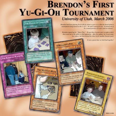
This one was a fun one to do, but it was also kinda difficult. The journalling is on the cards, and so I had to remove the game details and the names from the original card scans. Then the pictures were filtered using the poster line filter, and the end result is the cards. Once that was done, it was simply a matter of laying them out, cleaning up the edges, and adding the big text and journalling.
Tuesday, October 17, 2006
I blurred the central image a tich because these were shot with my cell phone camera. So, when I blew it up that large, I wanted to "mystify" it a bit, and hide the low-rezziness of it. I'm pretty pleased with this one, overall. I wonder if the pictures compete, but I'm not sure how to fix it, if they do.
Monday, October 16, 2006
Sunday, October 08, 2006
This is the first time I've tried a two-page spread in Photoshop. I'm not sure what I think of the results. I think the layout might be a little cluttered and disorganized. Like maybe I was trying to get too much stuff in there.
Anyway, imagine that they're side-by-side, with the second one to the right of the first.
Oh, well, you tell me whacha think...
Sunday, September 24, 2006
Not much to say about this one, really, in terms of making the layout. It's pretty typical of me. Bla bla bla. Still, it's fun to do. I did have to look up a sepia toning tutorial on the web to figure out how to do the two pics of brendon. Those were combined in layers with the original pic to maintain some color.
Saturday, September 16, 2006
Wednesday, September 13, 2006
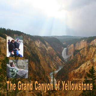
We've been vacationing in Jackson Hole, WY, for about a week, and a few days ago we did a jaunt around Yellowstone. The background shot was really cool, but it didn't really capture the drama of the sun in the clouds. But I found that when I adjusted the levels so that it did, the ground was almost blacked out. So, I had to separate the two areas of the picture into different layers and adjust them separately.
Subscribe to:
Posts (Atom)